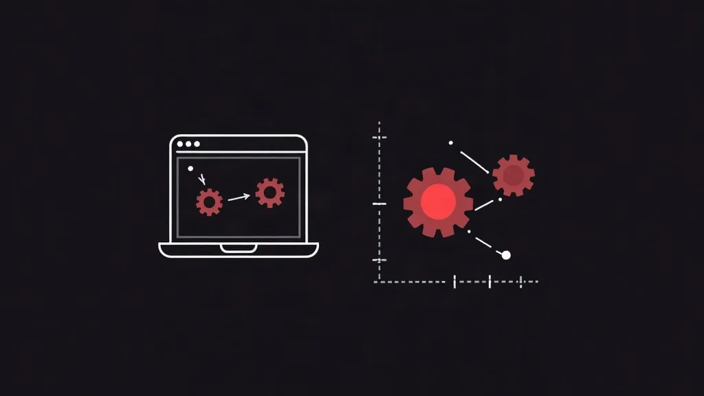
A visual redesign changes how your site looks, while a UX redesign changes how it works. UX redesigns tend to drive stronger, more measurable conversion gains because they remove friction in the user journey. The best results come from combining both, but if you must choose, start with UX and let data guide visual changes.
When your website stops delivering results, a redesign feels like the obvious answer. But "redesign" means very different things depending on who you ask. Some teams focus on making the site look more modern and polished. Others focus on how easily visitors can complete tasks and reach a purchase. These two approaches-visual redesign and UX redesign-can produce dramatically different outcomes for your bottom line.
If you are a business owner or decision-maker weighing the cost of a redesign, understanding this distinction is essential. Choosing the wrong approach can mean spending your budget on something that looks great but converts no better than before. This article breaks down both approaches, compares their impact on conversions, and helps you decide where to invest.
What Is a Visual Redesign?
A visual redesign is focused on aesthetics. It updates the surface layer of your website: colors, typography, imagery, spacing, icons, and overall style. The goal is to make your brand look current, credible, and consistent.
Visual redesigns matter more than some people admit. First impressions form in milliseconds, and studies consistently show that users judge credibility largely on visual design. An outdated or inconsistent look can quietly erode trust before a visitor even reads a word of your copy.
Common elements of a visual redesign include:
- Refreshed color palette and brand styling
- New photography, illustrations, or graphics
- Updated fonts and typographic hierarchy
- Modern layouts, shadows, and spacing
- Consistent buttons and visual components
The key limitation is that a visual redesign changes how your site looks, not necessarily how it works. You can make a checkout page beautiful, but if it still requires seven confusing steps, a fresh coat of paint will not fix the drop-off.
What Is a UX Redesign?
A UX (user experience) redesign is focused on function and flow. It looks at how visitors move through your site, where they get stuck, and what stops them from completing the actions that matter-signing up, requesting a quote, or making a purchase.
A UX redesign starts with data and research rather than taste. It examines analytics, heatmaps, session recordings, user testing, and customer feedback to identify friction points. Then it restructures navigation, content hierarchy, forms, and user journeys to remove obstacles.
Common elements of a UX redesign include:
- Simplified navigation and information architecture
- Streamlined checkout and lead-capture forms
- Clearer calls to action and page structure
- Faster load times and mobile-first flows
- Reduced steps in critical conversion paths
Because UX redesigns target the actual decision-making process of your visitors, they tend to produce more direct and measurable conversion improvements.
Conversion Impact: A Direct Comparison
Here is where the two approaches truly diverge. Both can improve conversions, but they do so in different ways and to different degrees.
Visual redesign impact
Visual improvements primarily affect trust and perceived quality. When your site looks professional, visitors are more willing to share their information or make a purchase. This can lift conversions-but the effect is often modest and indirect. A more attractive site does not automatically make it easier to buy.
Visual redesigns are most impactful when your current design is genuinely outdated, inconsistent, or off-brand. In those cases, the credibility boost can be significant. But if your design is already reasonably clean, another visual refresh may deliver diminishing returns.
UX redesign impact
UX improvements directly attack the reasons people abandon your site. Removing a confusing step, shortening a form, or clarifying a call to action can produce double-digit percentage gains in conversion rate. Because these changes address behavioral friction, the results are usually more dramatic and easier to trace.
For example, reducing the number of form fields in a lead-capture form frequently increases submissions. Simplifying a multi-page checkout into fewer steps consistently recovers abandoned carts. These are structural wins that a visual refresh alone cannot deliver.
The verdict
In most cases, a UX redesign drives stronger, more reliable conversion gains than a visual redesign. UX work removes the actual barriers between your visitor and the action you want them to take. Visual work influences perception, which is important but secondary when it comes to raw conversion numbers.
That said, the two are not mutually exclusive-and the best results almost always come from combining them.
Why the Best Redesigns Combine Both
Treating UX and visual design as competing choices is a false dichotomy. In practice, they reinforce each other. A beautifully designed page with a broken user flow frustrates people. A functional page that looks cheap fails to build trust. You need both to maximize conversions.
The most effective redesign process usually follows this order:
- Start with research and UX. Understand where users struggle and fix the structural problems first. This is where the largest conversion gains typically come from.
- Layer visual design on top. Once the flow works, apply strong visual design to reinforce trust, guide attention, and elevate your brand.
- Test and refine. Use A/B testing and analytics to confirm that changes actually improve results, rather than assuming they do.
When visual and UX design work together, aesthetics guide the eye toward the right actions, and functionality makes those actions effortless. That combination is what turns a redesign into a genuine growth investment.
How to Decide Where to Invest First
Most businesses cannot do everything at once, so prioritization matters. Use these questions to guide your decision:
Choose a UX redesign first if:
- Your analytics show high bounce or cart abandonment rates
- Visitors struggle to find key pages or complete forms
- Your conversion rate is low despite decent traffic
- Your mobile experience is clunky or slow
- You have never mapped your customer journey
Choose a visual redesign first if:
- Your site looks visibly dated compared to competitors
- Your branding is inconsistent across pages
- Visitors mention trust or credibility concerns
- Your design predates modern mobile standards
- Your flows already work but the look undermines them
If you are unsure, lean toward UX. Conversion problems are more often caused by friction than by appearance. You can validate this quickly by reviewing your analytics: if people arrive but do not convert, the issue is usually experiential, not just visual.
A practical middle path is to run a diagnostic audit before committing budget. A short review of heatmaps, session recordings, and funnel drop-offs will tell you whether your bottleneck is a broken flow or a weak first impression. That evidence lets you invest where the return is highest instead of guessing.
Measuring the Results
Whichever path you choose, measurement is what separates a real improvement from an expensive assumption. Before you redesign anything, record your baseline metrics: conversion rate, bounce rate, average session duration, and completion rates for key actions.
After launch, compare the same metrics over a meaningful period. Wherever possible, use A/B testing so you can attribute changes to specific decisions rather than to seasonality or traffic shifts. This discipline protects your budget and helps you build a case for future improvements.
Remember that conversion optimization is ongoing. A redesign is not a one-time fix but the start of a cycle of testing, learning, and refining. The businesses that win online treat their websites as living assets, not static brochures.
Conclusion
When it comes to conversion impact, a UX redesign usually delivers the stronger, more measurable return because it removes the real friction stopping people from acting. A visual redesign builds trust and credibility, which supports conversions but rarely transforms them on its own. The smartest approach is to combine both-fix the experience first, then elevate the visuals-while measuring results at every step.
Before you invest, look at your data and identify whether your problem is friction or first impression. That single insight will tell you where your budget should go. If you want expert help auditing your site and planning a redesign that actually grows revenue, our team can guide you from research to results.